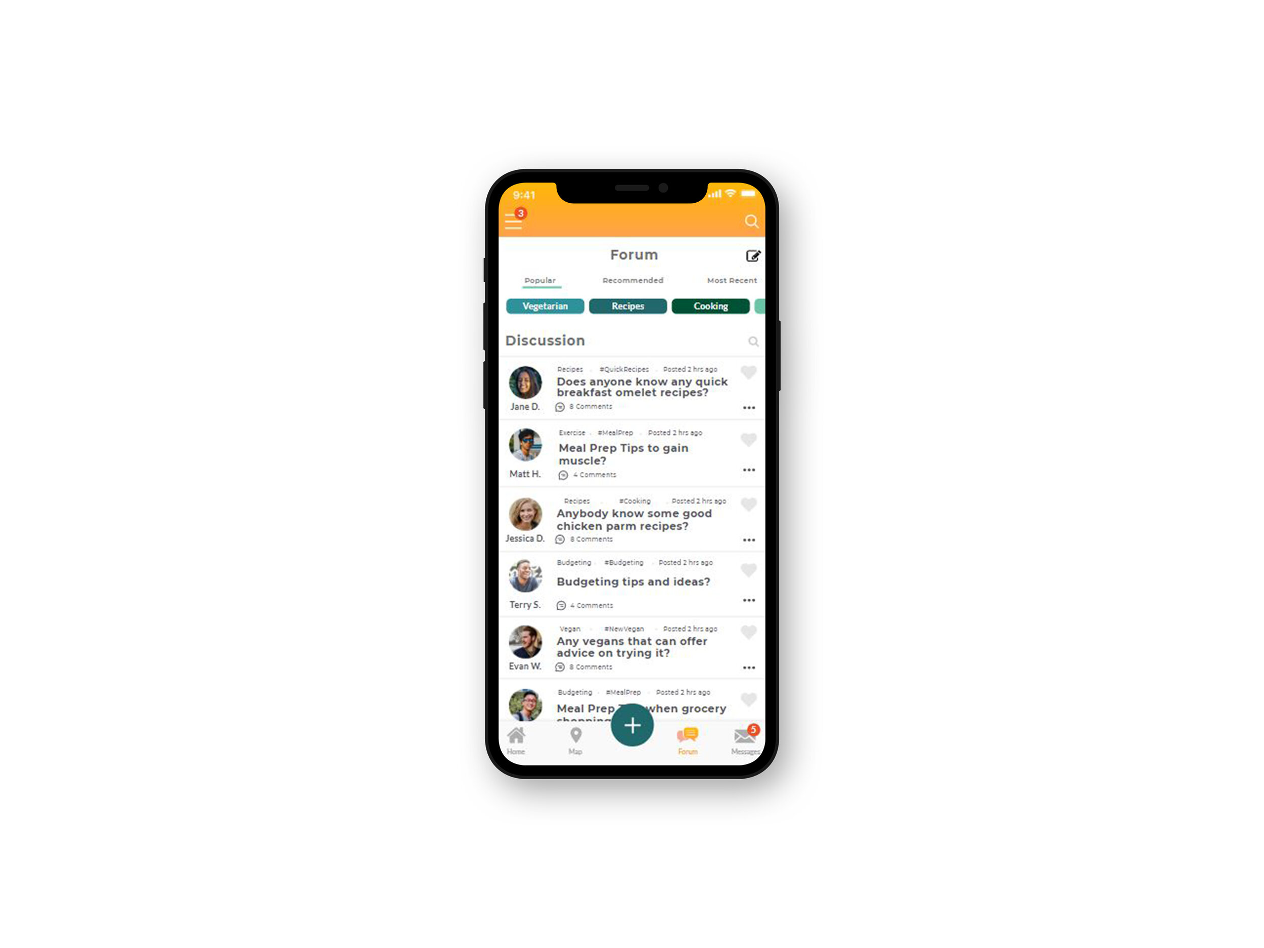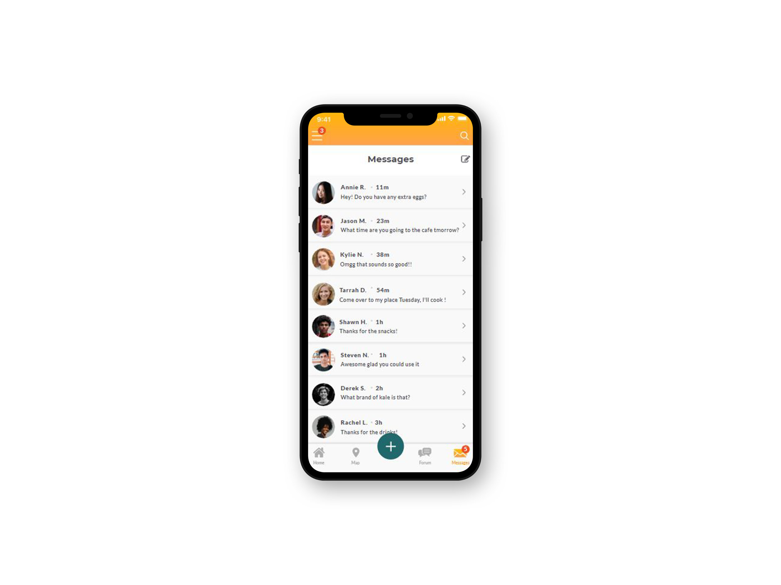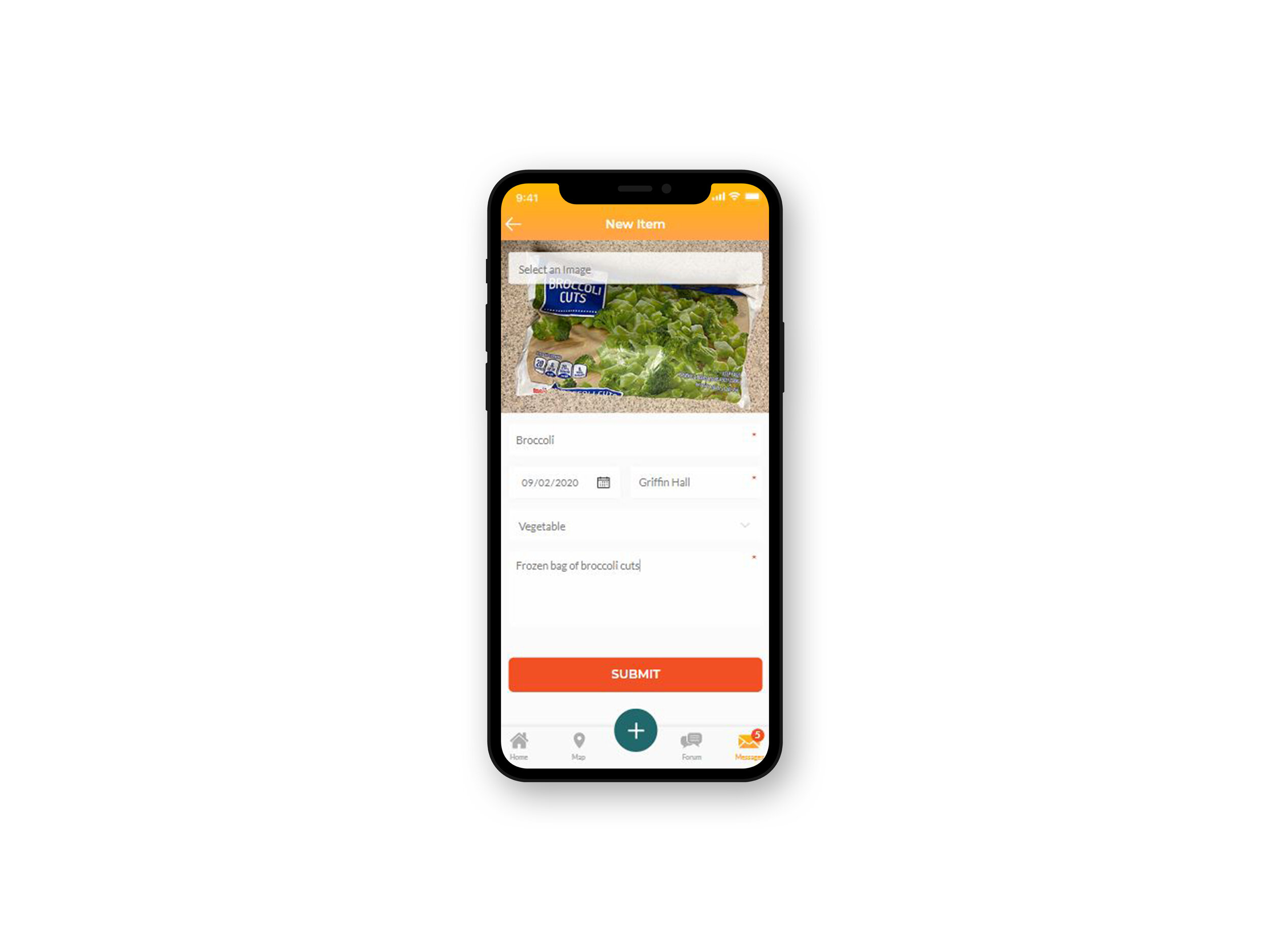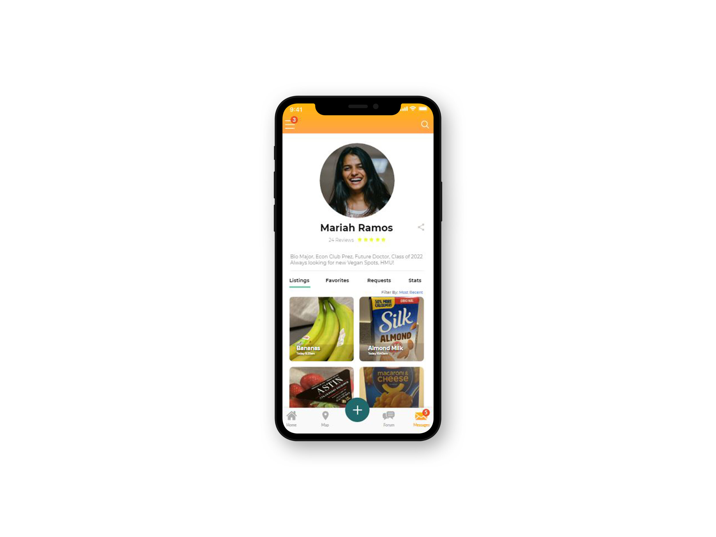
Meal Pass
UI/UX Design
The Problem
Food insecurity among college students continues to rise as students are forced to prioritize educational and living expenses over their basic dietary needs to make ends meet.
There needs to be a tool for students that provides them with food items and eliminates the stigma around food insecurity.
To begin to tackle this problem, I decided to split the process into 4 phases: User Research, Design, Testing, and Revision/Redesign.
My Process.
User Research.
In the user research phase, I first interviewed and surveyed college students using Qualtrics to understand their behaviors and motivations, such as how often they grocery shopped, if they budgeted their expenses, and what they did with food they did not use. I created personas, scenarios, and user flows based on my assumptions about my user base. I also performed a competitive analysis and read user reviews of other food sharing apps within the app store to understand user pain-points and problems with the current application, while discovering the most useful features.
Design.
Once I shifted to the design phase, I created moodboards to develop a color palette and overall aesthetic for the app. For an app centered around food and connections, I decided on a warm color palette that would bring a fun, vibrant energy to the app. After this I began to sketch the layout to figure out the best hierarchy and flow of the app. Using Adobe XD to wireframe and solidify the structure, I moved to Axure RP to develop the interactions of my high-fidelity prototype.
Testing.
I initially designed the prototype to be used and tested by users on my iPhone 11 to avoid any issues in the browser and to conduct my user testing in person, however I transitioned to remote testing students using Zoom to reach more users, allow me observe interaction, and moderate when needed. Qualtrics was used to gain feedback from users.
Redesign.
After the testing sessions, I evaluated the feedback, revised my design, then retested users to pinpoint any problems and changes needed to be made. I performed a heuristic evaluation on the prototype during testing and retesting to find any areas that needed improvement and ensure the designs were aligned with usability guidelines and principles.
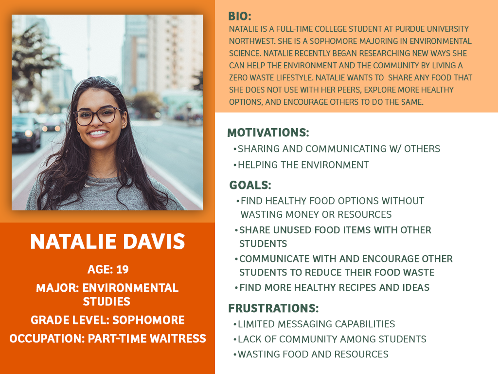
Personas
Throughout my user research, I found out that some of the major barriers preventing students from using food resources like food pantries and apps were:
lack of accessibility
lack of information
social stigma/embarrassment
I modelled my personas around typical lifestyles of college students that would use my app.
Design
When exploring color palettes, I found that all the major restaurant and food brands like McDonald's, Wendy's, Burger King use reds, yellows, oranges because most foods we eat have bright and warm or green and earthy colors.
I wanted my app to be associated with warm and happy feelings of food and community.
Sketches
When brainstorming design concepts, I looked at the common layouts of shopping, messaging, and food delivery apps. I wanted the app to feel like a community pantry for students to be comfortable sharing not just food, but have conversation, so I had to figure out how to incorporate all of these features without overloading screens and making the process quick and easy.


