Game Time
UX Design
The Problem
Time is a commodity that is easy to waste and impossible to get back. That is why time management has become such an important skill to practice in our daily lives. Now that video games have become more and more popular, the gaming community continues to grow and expand. As popularity increases and the games become more addictive, there has been an increase in the amount of time people spend playing video games. This use of time can be seen as positive or negative, causing some players to want to monitor the amount of time devoted to game play. This project aims to help users in this using an app that tracks the amount of time spent playing video games.

My Process.
Problem Definition.
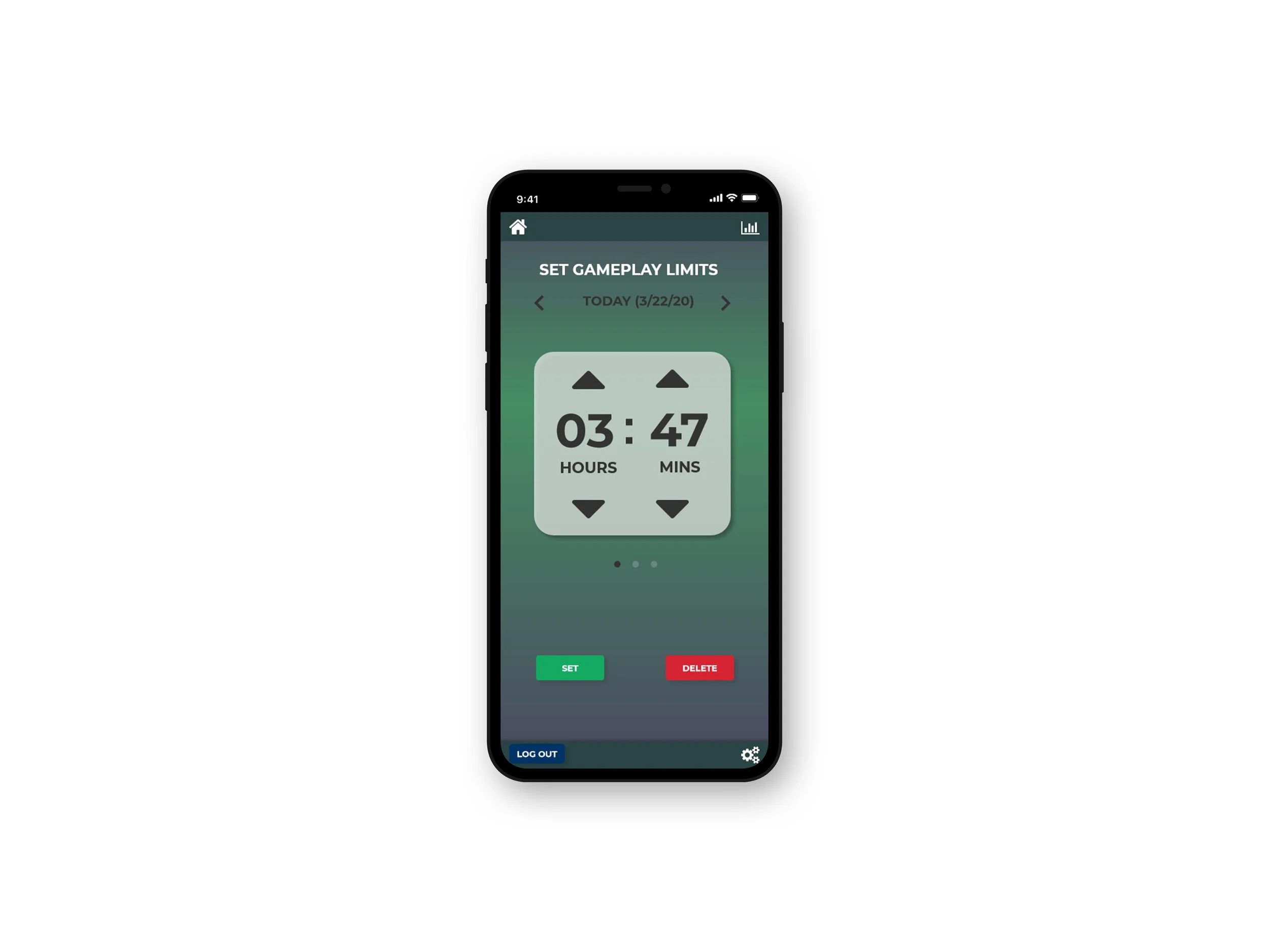
The purpose of this app is to enable users to view, monitor, and limit the amount of time spent playing video games. Some view the excess amount of time spent playing video games as a waste and may want to change their habits accordingly. Others may view the amount of time as
productive toward their game play goals and may want to share and increase their times. The app will be a reflection of habits by the gamer to help with time management and productivity.
Brainstorming.
I sketched and brainstormed ideas that would focus on the following KEY FEATURES:
Data Sourcing: users can choose where they'd like the app to collect data from or input manually
Goal Setting: users can set goals or limit game play time
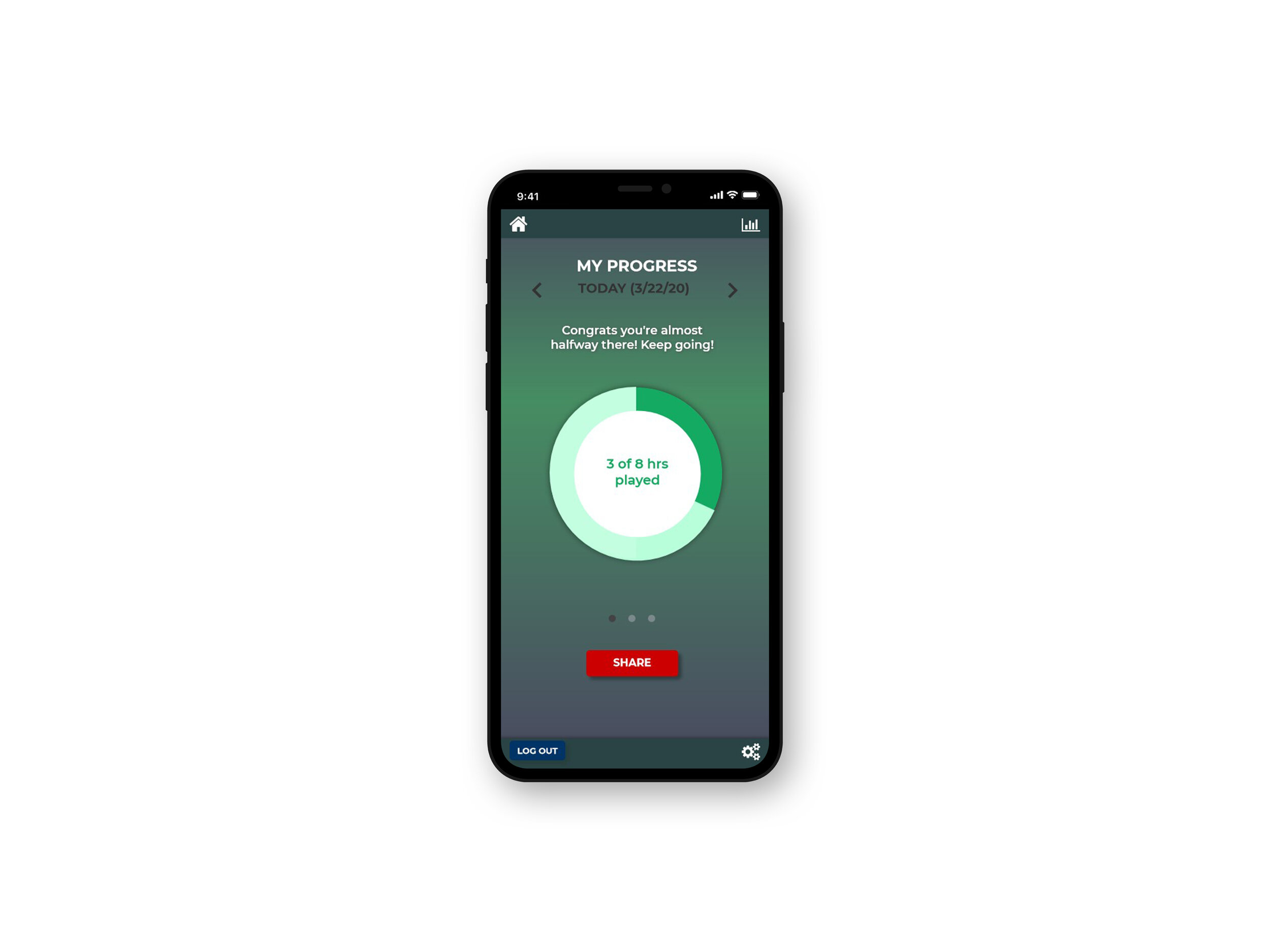
Output Display: visualizations of progress
Motivational Sharing: allows users to share data via social media
Design.
I went with a dark, cool color scheme because its a common tone used in gamer environments. Based on my wireframes and the information gathered in previous steps, I created a high fidelity prototype in Axure RP. The user will be to easily navigate through these pages as I made sure to follow some of the principles of harmonious interactions, such as including fewer but necessary items, providing commands, and maintaining the flow so that the user can complete their tasks efficiently.

Sketches
For the designs, I wanted it to be easy to set times and view gameplay progress stats. I decided the best way to show progress would be a large graph and wanted the process of setting gameplay limits to feel similar to setting an alarm/timer.
To better understand the flow and page hierarchy of the app, I started sketching each of the screens and their connections. I wrote brief descriptions of the required actions taken by the user to navigate through the pages and successfully track their gameplay hours.